Waterfall Plots with ggplot2
Waterfall Plots
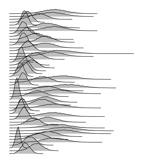
As a performance engineer, I spend a ton of time trying to visualize latency and other system data in ways that make it easy to summarize the characteristics of complex systems. In looking for ways to plot many discrete histograms side-by-side (3 dimensions, x=value, y=count, z=group), I came across Brendan Gregg’s outstanding work with latency heatmaps and waterfall plots. Coalescing the distributions into a heatmap did not fit well with my specific use case, as each distribution was discrete and independent of the other distributions, but the waterfall visualizations would perfectly capture what I was trying to show.

Brendan provides the source code to generate this style of plot, though it requires jumping from R to ImageMagick to lay out the distributions. After searching more for a fully encapsulated solution, I could not find a way to plot data in this style fully inside of R, without depending on any post-processing in another program (e.g GNUPlot, ImageMagick).
The strategy
I decided to take a crack at it using ggplot. My idea was to take each group in the dataset and shift it up the y-axis proportional to the group’s ordinal index among all groups. I’d then use white or black coloring under the curve to “cover up” the groups that are below the current group in terms of z-index (in web design terms). We’ll then remove all axis, labels, and legends to make the visualization clean. The y-axis certainly doesn’t make sense to display since we are artificially setting y values, but the x-axis could be kept should the need arise.
What doesn’t work
My first attempt using standard ggplot syntax looked something like this:
# @Param data - a data.table containing the x,y values to plot
# @Param xVar - The variable in data to use as the x-axis variable
# @Param yVar - The variable in data to use as the y-axis variable
# @Param groupVar - The variable in data to use to split data into multiple series
# @Param offset - The multiplier to shift groups up the y-axis by. Defaults to the 75th percentile of yVar
# @Param invertColor - White/Black background/lines
plotWaterfall = function(data,xVar, yVar, groupVar, offset=NULL, invertColor=F) {
#Remove all axis/labels/legends
p=ggplot()+theme(axis.line=element_blank(),
axis.text.x=element_blank(),
axis.text.y=element_blank(),
axis.ticks=element_blank(),
axis.title.x=element_blank(),
axis.title.y=element_blank(),
legend.position="none",
panel.background=element_rect(fill = ifelse(invertColor,"black", "white")),
panel.border=element_blank(),
panel.grid.major=element_blank(),
panel.grid.minor=element_blank(),
plot.background=element_blank())
if(is.null(offset)) {
#Pick the 75th percentile of the entire dataset to use as an offset. Seems to work well
offset = quantile(data[,get(yVar)], 0.75)
}
#Apply our offset to the y-value to shift the entire group upward
x=data[, list(x=get(xVar), y=get(yVar)+(offset*get(groupVar)), grp=get(groupVar))]
p=ggplot(x, aes_string(x=x, y=y, group=grp)) +
#Under-the-line white/black color to coverup shapes "below" it on the z-axis
geom_ribbon(fill=ifelse(invertColor,"black", "white"),ymin=0, aes(ymax=y))+
#The line to show
geom_line(color=ifelse(invertColor,"white", "black"))
return(p)
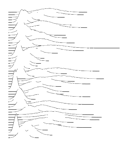
}Although ggplot2 will create two layers for every value in groupVar, the ordering of the layers causes this plot to fall short. Ggplot2 will first create N layers of ribbons, followed by N layers of lines on top of them. Since the line and the ribbon for any given group do not have the same z-index, we aren’t able to cover up lines with ribbons.
Switching the order of the geom_ribbon and geom_line also doesn’t help, as the ribbons will end up hiding lines below it on the y-axis.
What works
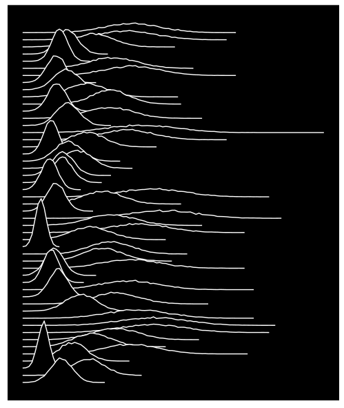
Changing our ggplot construction to individually add groups two layers at a time will give us the z-index grouping we require to make this visualization. While it’s not the prettiest ggplot syntax, it gives us what we’re looking for in a quick manner.
# @Param data - a data.table containing the x,y values to plot
# @Param xVar - The variable in data to use as the x-axis variable
# @Param yVar - The variable in data to use as the y-axis variable
# @Param groupVar - The variable in data to use to split data into multiple series
# @Param offset - The multiplier to shift groups up the y-axis by. Defaults to the 75th percentile of yVar
# @Param invertColor - White/Black background/lines
plotWaterfall = function(data,xVar, yVar, groupVar, offset=NULL, invertColor=F) {
#Remove all axis/labels/legends
p=ggplot()+theme(axis.line=element_blank(),
axis.text.x=element_blank(),
axis.text.y=element_blank(),
axis.ticks=element_blank(),
axis.title.x=element_blank(),
axis.title.y=element_blank(),
legend.position="none",
panel.background=element_rect(fill = ifelse(invertColor,"black", "white")),
panel.border=element_blank(),
panel.grid.major=element_blank(),
panel.grid.minor=element_blank(),
plot.background=element_blank())
#Work thru the groups in reverse order so that the highest group has the lowest z-index and the series at the bottom is in the foreground
uniqGroups=rev(unique(data[,get(groupVar)]))
nGroups = length(uniqGroups);
if(is.null(offset)) {
#Pick the 75th percentile of the entire dataset to use as an offset. Seems to work well
offset = quantile(data[,get(yVar)], 0.75)
}
for( q in 1:nGroups) {
group=uniqGroups[q]
baseline=offset*(nGroups - q - 1);
#Get a data.table that only contains our group.
x=data[get(groupVar)==group, list(x=get(xVar), y=get(yVar)+baseline, grp=get(groupVar))]
#Add a single ribbon and a single line to the plot
p=p+
geom_ribbon(data=x,fill=ifelse(invertColor,"black", "white"),ymin=baseline, aes(x=x, ymax=y))+
geom_line(data=x,aes(x=x, y=y), color=ifelse(invertColor,"white", "black"))
}
return(p)
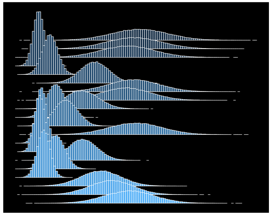
}Plotting Histograms directly
Plotting histograms instead of density makes things a little easier and allows us to use standard ggplot syntax. The white outlines (the “color” aesthetic in geom_rect) can be removed in favor of just the “fill” aesthetic if they become distracting.
  plotWaterfallHistograms=function(data,variable, groupVar, binWidth, offset=NULL, invertColor=F) {
  minVal=min(data[,get(variable)], na.rm=T)
  maxVal=max(data[,get(variable)], na.rm=T)
  brks = seq(minVal, maxVal, binWidth);
  df=data[,list(num=.N),by=list(group=get(groupVar), bin=cut(as.numeric(get(variable)), brks, dig.lab=10))]
  df[, i:=.GRP,by=group]

  df[,lower:=as.numeric( sub("\\((.+),.*", "\\1", bin))];
  df[,upper:=as.numeric( sub("[^,]*,([^]]*)\\]", "\\1", bin) )];

  grps=uniqueN(df[,list(i)])
  if(is.null(offset)) {
    #Pick the 75th percentile of the entire dataset to use as an offset.  Seems to work well

    offset = quantile(df$num, 0.75)
  }

  p=ggplot(df,aes(xmin=lower, xmax=upper, ymin=(grps-i)*offset, ymax=(grps-i)*offset+num, group=i, fill=i) )+
    geom_rect( color=ifelse(invertColor,"white", "black"))+
    +theme(axis.line=element_blank(),
           axis.text.x=element_blank(),
           axis.text.y=element_blank(),
           axis.ticks=element_blank(),
           axis.title.x=element_blank(),
           axis.title.y=element_blank(),
           legend.position="none",
           panel.background=element_rect(fill = ifelse(invertColor,"black", "white")),
           panel.border=element_blank(),
           panel.grid.major=element_blank(),
           panel.grid.minor=element_blank(),
           plot.background=element_blank())
  return(p)
  }
Further Reading & Resources
Waterfall plots on Wikipedia
Sample dataset generation
Generate a data.table and subsequent histogram data to pass into waterfall generation. Requires rcpp code from my post on classifying jitter
require(data.table)
require(Rcpp)
require(ggplot2)
nextTime = function(n, rateParameter) {
return(sapply(1:n,function(i) -log(1.0 - runif(1)) / rateParameter))
}
allMsgs=lapply(1:50,function(d) {
# Randomly calculate 1000 message interarrivals using Poisson processes
messages = data.table("idx" = nextTime(10000,d))
messages[,responseTime:=rnorm(.N,runif(1,5,20),runif(1,1,7))]
messages[,responseTime:=responseTime-min(responseTime)]
messages[,run:=as.character(d)]
return(messages)
})
allMsgs=rbindlist(allMsgs)
#Bin the data
data=allMsgs[,list(num=.N),by=list(run, bin=cut(responseTime, 100))]
#Adjust the bins to numerics
labs=levels(data$bin)
levels(data$bin) = as.numeric( sub("\\((.+),.*", "\\1", labs))
data[,bin:=as.numeric(levels(bin))[bin]]
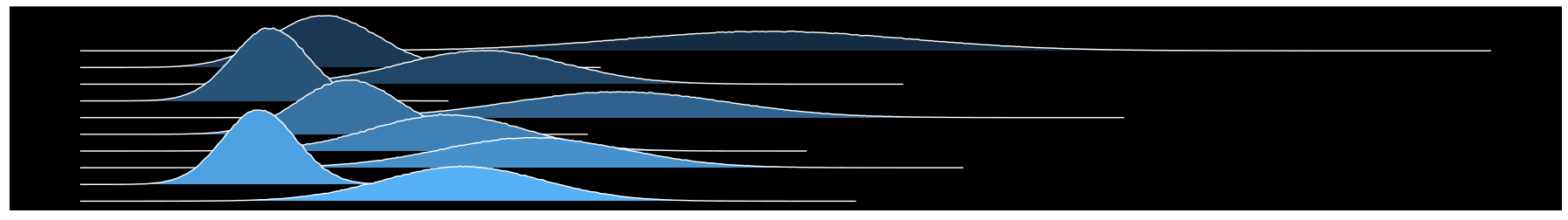
plotWaterfall(data, "bin", "num", "run", invertColor = T)
Leave a Comment