How To Talk About Performance - Part 1
In 90% of the software engineering world, performance is often something that is “fine until it isn’t”, where only the most concerned developers mull over latency metrics until there is a some kind of capacity issue or noticeable performance degradation to the end user. This post is intended to be a crash course on how to answer the call your infrastructure & ops team sounds the alarm because your application can’t keep up with demand and you must confront a performance problem.
In the algorithmic trading industry, performance is not a peripheral feature or afterthought, instead it is a front and center requirement, down to the microsecond - something that makes or breaks trading strategies and bank accounts. As a result, most involved with electronic trading have an appreciation for high performance and some level of understanding about it: the engineers writing the systems, finance folks developing the strategies, even HR, to recruit talented latency specialists. Even still, in my own experience, few outside of engineering are fluent in performance-speak.
The Numbers
First, a short stats review to learn what we should actually be looking at and how to look at it. I will probably end up writing a whole post on how to measure latency, but for now I’ll assume that we have some method of collecting and analyzing raw latency datapoints from our system.
Percentiles, not Averages
Many real world datasets do not give us a clean Normal Distribution. We almost always must contend with outliers - datapoints which easily skew common metrics such as averages. Consider data taken from IMDB counting the number of movies with any given number of user votes:
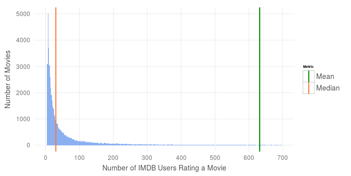
This distribution makes sense - only the biggest and best movies receive the attention of hundreds of IMDB reviewers, while most lesser known (independent, perhaps) films only garner a handful of votes. The few most popular movies pull our mean number of votes far to the right, while the median proves to be more robust to these outliers. In plain English, the median tells us that half of the movies on IMDB garner less than 30 votes.
Similarly, performance data often follows a similar distribution - Many datapoints clustered with similar latencies, but a smaller number of datapoints with much higher latencies that drag the tail of the distribution far to the right. Consequently, the mean is not going to do us much good as a summary of latency, since it is easily influenced by outliers (i.e it is not a robust measure of center).
Even if your system’s response time followed a normal curve, is the average really what you’re looking for? A measure of center only tells you what latency looks like when the system is performing as-expected. When debugging a performance issue or tuning to strict response time requirements, your interest should lie in the exceptional cases versus the expected cases.
To get a clear picture of how fast your system truly is, look at a percentile ranking of performance numbers. Percentiles are robust to any distribution, meaning that they are unaffected by extreme outliers and can tell you how your system responds in both the average and exceptional cases. The 50th (median), 90th, 95th, and 99th percentiles provide a good summary, though more percentiles can be provided based on your latency sensitivity.
Median Absolute Deviation, not Standard Deviation
A metric commonly reported side-by-side with averages is a standard deviation, which measures the variance of a numerical dataset. Much like the mean, standard deviation can be skewed by outliers and does not hold much value for non-normal distributions.
Instead, consider looking at Median absolution deviation (MAD), which is the median of the deviations from the median of the overall dataset.
Unfortunately, the robustness of the MAD is a double-edged sword. It is hardly affected by outliers, unlike the Std. Dev, and can tell us a lot about the variance of the majority of datapoints, though since we’re often interested in the higher percentiles representing <5% of all datapoints. We need a metric that summarizes the changes between the middle and the upper percentiles. To do this, I calculate a homemade metric I call Percentile Ratio Measure (PRM), which sums the calculated ratios between selected percentiles, and weights them inversely to the distance from the median (e.g the 75th/50th ratio may have a weighting of 1, while the ratio between 90th/75th might be weighted as 0.5). There isn’t a one-size-fits-all formula to calculate this metric, and the percentiles and associated weights can be tuned based on your sensitivity to latency variance. An example calculation is included at the end of this post.
Importance of Visualizing Latency
Throughout my career, I’ve learned that a non-technical audience responds better to beautifully-presented technical information than ugly presentations or numbers alone. Spending an extra 10min to make an excel chart clean and clear goes a long way, and spending a few days learning ggplot2 for R goes even further in making your data easily understandable.
Visual appeal aside, there are real datasets where numbers alone obfuscate important characteristics. Anscombe’s quartet best demonstrates an example of lying statistics. Four unique numerical datasets comprise the quartet, each having an identical mean, standard deviation, etc - By the numbers, the four sets are exactly the same. Plotting the datasets side-by-side reveals just how different each set is.

Consider the following two percentile distributions of response time performance numbers in milliseconds:
| Percentile | Set A | Set B |
|---|---|---|
| 25th | 46.9 | 46.9 |
| 50th | 50.5 | 51.5 |
| 75th | 54.9 | 55.9 |
| 90th | 66.7 | 67.3 |
| 95th | 70.5 | 72.5 |
| 99th | 82.8 | 83.7 |
Across all key percentiles, the two distributions appear to be nearly identical - Some minor differences, but nothing that would raise any red flags. Given only this set of percentiles, it looks as if they could have been sampled from the same pool of numbers.
But when we plot the cumulative distributions of both datasets, we see an interesting characteristic of one of the datasets. In a cumulative distribution, groups of similar datapoints show themselves as near-verticle lines, indicating multiple percentiles sharing similar values. Most of the datapoints across these distributions fall in the 45-55ms range, indicated by the near-verticle line at ~50ms, and both have similar tails (<10th and >90th percentiles), but set B appears to have a significant number of datapoints reporting latencies of ~65ms.
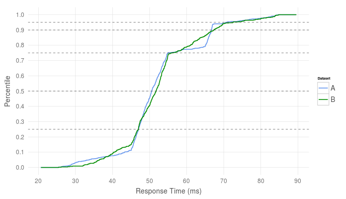
I’ve also plotted lines which mark the key percentiles that we reported above to show how little they describe the real distribution
This tells us there may be two “modes” of operation in the measured system. Two different types of messages following different code paths, where one path could be faster than the other, could be a cause of these two modes. Another cause could be system jitter, where the OS, a (J)VM, the kernel, the hardware, or even the BIOS (with SMI routines) comes in and disrupts the application for a period of time.
Plotting a timeseries of the latency data can help us better identify this mode.
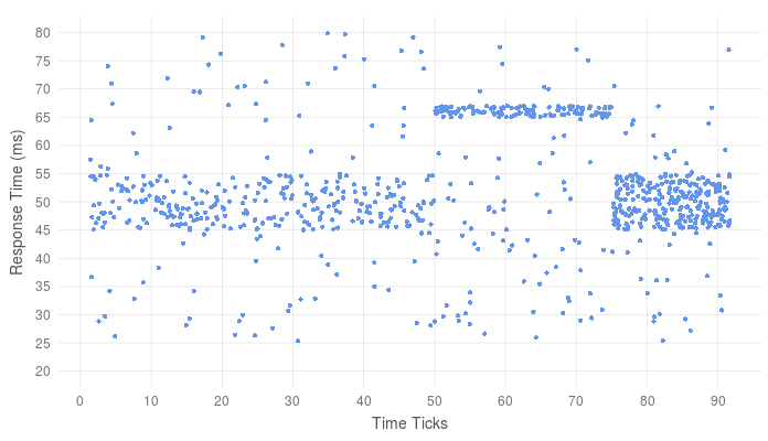
If the two performance modes are expected (i.e there are are two different code paths), we might expect to see two “stripes” of datapoints over time. If system jitter is the cause, kicks in for a short period of time, we would see latency toggle from one mode of operation to the other, which is exactly what we see here. Given the nature of this “toggling”, its likely that something like CPU power saving mode disrupts the performance of the application. (This of course is faked data, but I can assure you this very same latency profile is prevalent in the wild)
Up Next
Now that we have a foundation for reporting our results, we must learn what we should actually be measuring in our system. In part two, we will look at the differences between “Service Time” and “Response Time”.
Further Reading & Resources
PRM Calculation
Given a set of datapoints x, and a function P that calculates a list of percentiles p from the set of datapoints, we calculate PRM as follows:
For example, using the percentiles from set A above (50th - 99th),
Generating the Graphs
R and the ggplot2 library were used to generate the charts in this post (excluding Anscombe’s Quartet), Here’s the code I used to make them:
IMBD Movie Data
number_ticks = function(n) {function(limits) pretty(limits,n)};
require(data.table)
ggplot(movies, aes(x=votes))+
  geom_histogram(binwidth = 1, fill="cornflowerblue", alpha=0.75) +
  scale_color_manual(name="Metric", values=c("Mean"="green4", "Median"="#f47c3c"),labels = c('Mean','Median') )+
  geom_vline(data=data.table(val=c(mean(movies$votes), median(movies$votes)), lab=c("Mean", "Median")), aes(xintercept=val, color=lab), size=1, show_guide = TRUE)+
  xlab("Number of IMDB Users Rating a Movie") +
  ylab("Number of Movies")+
  scale_x_continuous(limits=c(0,700),breaks=number_ticks(10))+
  scale_y_continuous(breaks=number_ticks(5));
}
Cumulative Distribution
require(data.table)
#Build the distributions

randDist=data.table(var = c(runif(250, min=45, max=55),
                            runif(100, min=25, max=85),
                            runif(200, min=35, max=70)), Dataset="B");


jitterDist = data.table(var=c(runif(500, min=45, max=55),
                              runif(200, min=25, max=85),
                              runif(50, min=25,max=55),
                              runif(120, min=65, max=67)), Dataset="A")

#Create timestamps

maxTime = min(nrow(jitterDist), nrow(randDist))/6
randDist$Time=runif(nrow(randDist), min=1, max=maxTime)
jitterDist$Time=c(runif(250, min=1, max=50),
                  runif(250, min=75, max=maxTime),
                  runif(250, min=1, max=maxTime) ,
                  runif(120, min=50,max=75));

ggplot(rbind(randDist,jitterDist), aes(x=var, color=Dataset))+
  stat_ecdf(size=0.75)+
  scale_color_manual(values=c("cornflowerblue", "green4"))+
  geom_hline(yintercept=c(0.5,0.75,0.9,0.95, 0.25), alpha=0.5, linetype="dashed")+
  ylab("Percentile")+xlab("Response Time (ms)")+
  scale_x_continuous(breaks=number_ticks(10))+
  scale_y_continuous(breaks=number_ticks(10))
Latency Timeseries
ggplot(jitterDist, aes(x=Time, y=var))+
  geom_point(color="cornflowerblue")+
  ylab("Response Time (ms)")+
  xlab("Time Ticks")+
  scale_y_continuous(breaks=number_ticks(10), limits=c(20,80))+
  scale_x_continuous(breaks=number_ticks(10))
Leave a Comment